We’ve put together this brief getting started guide to help you find what you are looking for in the dashboard and to understand what you are seeing. For a more detailed description of using filters, data layers and extracting data sets, please refer to the Near Miss and Dangerous Locations User Guide [Coming Soon!].
Use the links below to jump to a specific area of the Quick Start Guide:
- What is the Northern Virginia Near Miss and Dangerous Locations Dashboard?
- Overview of the Dashboard
- Filtering Data Shown in Map and Charts
- Resetting the Dashboard
What is the Northern Virginia Near Miss and Dangerous Locations Dashboard?
The dashboard is a visualization of crowdsourced Near Miss and Dangerous Location reports provided by people who walk, bike or drive on Northern Virginia streets, roads and sidewalks. The reports are gathered by NoVA Families for Safe Streets, a 501(c)(3) non-profit organization. TREDS (Traffic Records Electronic Data System) data is also provided in the dashboard to allow exploration of potential correlations between Near Miss, Dangerous Location and actual crash data provided by the Virginia Department of Motor Vehicles.
Overview of the Dashboard
The default view of the dashboard displays the header, left panel, center panel (map), bottom panel, right panel and filter tab.

Header
Click on the NoVA Families for Safe Streets logo to return to the website.
Center Panel (Map)
The default display is a street map overview of Arlington, Alexandria and Fairfax Counties.
Near Miss reports are displayed in red clusters labeled with the total number of reports that have been submitted in a specific area.
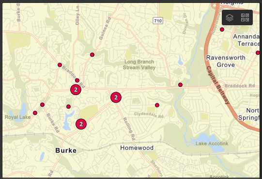
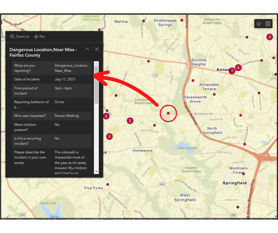
To find specific reports, depending on the device you are using, scroll using your cursor or pinch with your fingers to zoom in on the cluster of interest. As you zoom in clusters will become smaller and eventually split into dots that represent individual Near Miss or Dangerous Locations reports. When you click on a dot, a report window will display as shown below which will contain details of the selected report.
To change the view from the default street map to another type of basemap, you can click on the basemap icon in the top right of the map ( ![]() ) to get a list of choices. For basemap descriptions, please refer to the User Guide [Coming Soon!].
) to get a list of choices. For basemap descriptions, please refer to the User Guide [Coming Soon!].
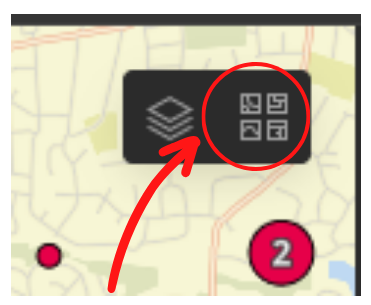
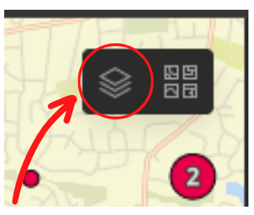
To change the data that you see from all Near Miss/Dangerous Locations to other reports, such as by time, type of jurisdiction or data type, i.e., Near Miss, Dangerous Location and TREDS, click on the data layer map icon in the top right of the map ( ![]() ) to get a list of choices. For data layer descriptions, please refer to the User Guide [Coming Soon!].
) to get a list of choices. For data layer descriptions, please refer to the User Guide [Coming Soon!].
Right Panel
This panel displays a Data Legend associated with the selected data layer(s).
Bottom Panel
The bottom panel is used to select and display pre-selected overviews of TREDS and Near Miss reports.
Left Panel
The left panel presents pre-selected Near Miss data reports. Bottom tabs can be used to show incidents by Hour, Day and Month. The data visualizations can be enlarged and then reduced by using the zoom in/out icon in the top right hand corner.
Filtering Data Shown in Map and Charts
Dashboard data filters can be accessed by selecting the filter tab on the far left of the Left Panel.
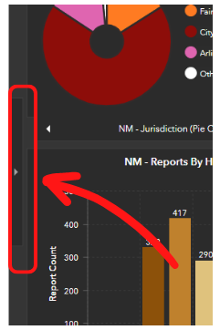
Once selected, the panel expands to provide a range of filters that can be used to drill down and analyze data at a more discrete level of detail. For filter descriptions, please refer to the User Guide. If you want to pin the filter tab on the dashboard for continued use, you can select the blue “pin” in the upper right corner of the menu.

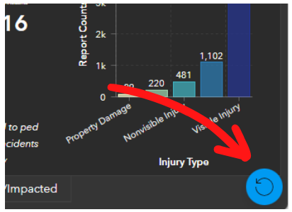
Resetting the Dashboard
After selecting one or more filters, changing the default basemap, and/or changing the default data layers, it is possible to ‘reset’ the dashboard using the Reset button in the bottom right corner of the dashboard. The Reset button will not be shown until a default setting has been changed.